
Michael De Muniz · Website concepts

Four directions for your website.

Same firm, same photos, same facts. Each concept gives your story a different feel. Open each one, click around, and tell us which fits you best.

Each concept opens in this tab. To come back here, tap the small arrow on the right edge of the page and choose Back to all concepts.

Side by side

Same content. A different feel.

Here is the same section, Practice Areas, in each concept. It shows the difference better than words can.

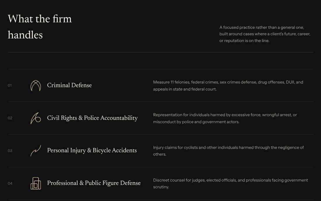
Concept 01 Practice Areas: a simple numbered list

Practice Areas in Concept 01

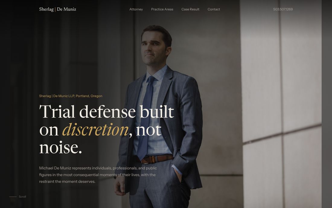
Concept 01Editorial

The feel
Calm and classic, like a well edited magazine. Large type, plenty of space, and nothing shouting for attention.
How it works
Practice areas read as a simple numbered list. The case result reads as a short story, start to finish.
Choose it if
You want the firm to feel discreet, established, and in control.
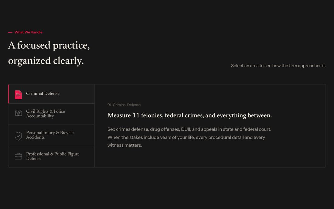
Concept 02 Practice Areas: clickable tabs with a detail panel

Practice Areas in Concept 02

Concept 02Guided

The feel
Clear and organized. Visitors always know where they are and what to do next.
How it works
Click an area to see how the firm approaches it. The case result unfolds in three steps, and common questions open right in place.
Choose it if
You want potential clients to find answers quickly and feel in control.
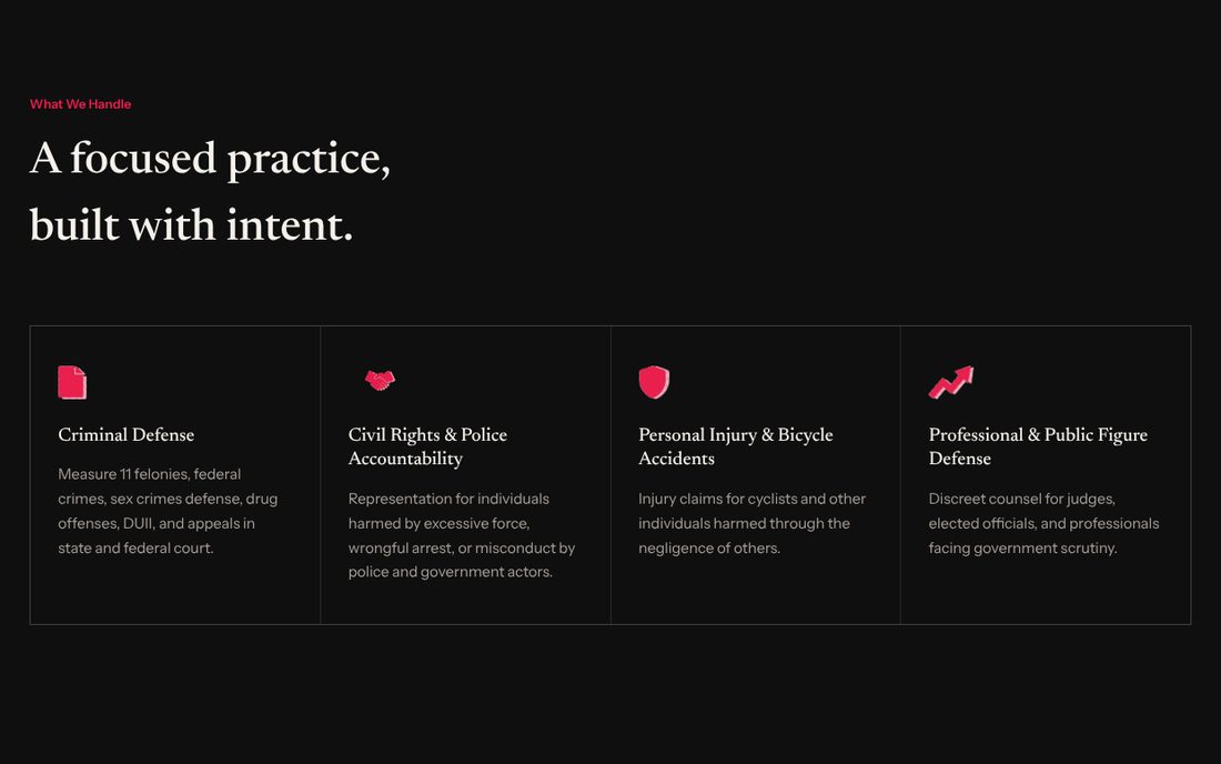
Concept 03 Practice Areas: four cards with bold icons

Practice Areas in Concept 03

Concept 03Dynamic

The feel
Confident and energetic. The page moves as you scroll, so it never feels static.
How it works
Sections slide into view and numbers count up. The case result plays out as full-screen scenes.
Choose it if
You want the firm to feel modern and stay in people's memory.
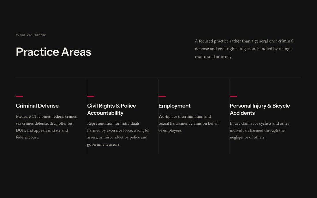
Concept 04 Practice Areas: four columns with a red accent line

Practice Areas in Concept 04

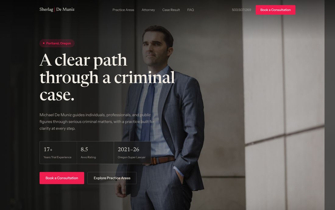
Concept 04Direct

The feel
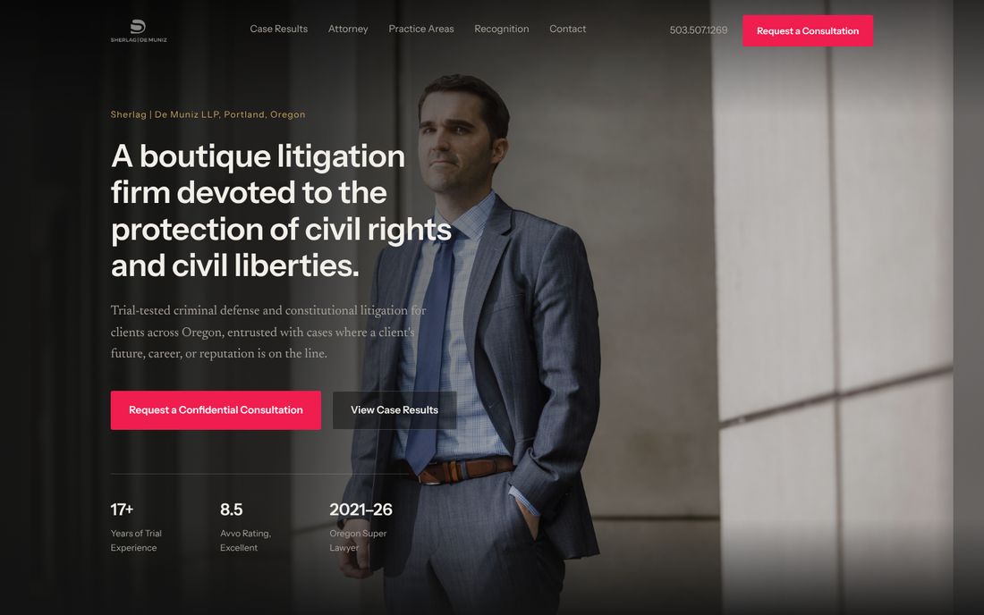
Strong and straightforward. A bold headline over a full-width portrait of Michael, with nothing in the way.
How it works
Key credentials sit in a bar right under the opening screen. The case result appears beside a large courthouse photo, and practice areas sit in four clean columns.
Choose it if
You want a clear, no-nonsense site that gets to the point and lets your record speak for itself.

Your turn

Which one feels most like you?

There is no wrong answer, and nothing here is final. Tell us which concept you like best, plus anything you would borrow from the others, and we will take it from there.

Your choice

Your choice

Add anything you would like us to know, then send it with whichever option works best for you.

Or write to us directly at raymond@duraysdev.com